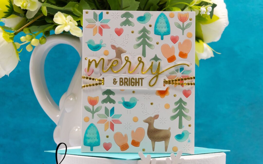
Merry & Bright
This “merry & bright” card from the new Simon Says Stamp Sugar and Spice release features inlaid die cuts, festive icons, and a playful color palette. I added sparkle with gold ribbon and a foiled sentiment for a polished finish that feels joyful and modern.

Calm, Bright, and Beautifully Simple
For this Christmas card, I used the October 2025 Clear Stamp of the Month from Spellbinders for the sentiment and paired it with older products in my stash. A glowing city skyline, Santa’s sleigh, and a bold blue sky make this clean and simple design both peaceful and festive.
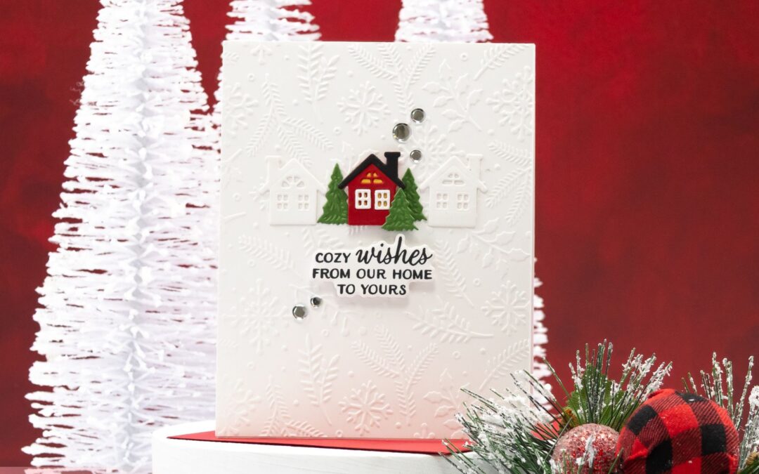
Cozy Wishes for the Season
For this card, I used the October 2025 Embossing Folder of the Month and the Stamp and Die of the Month Club products from Spellbinders. The embossed background pairs beautifully with the bold red house and simple sentiment, creating a clean and cozy holiday card that’s perfect for sending warm wishes this season.
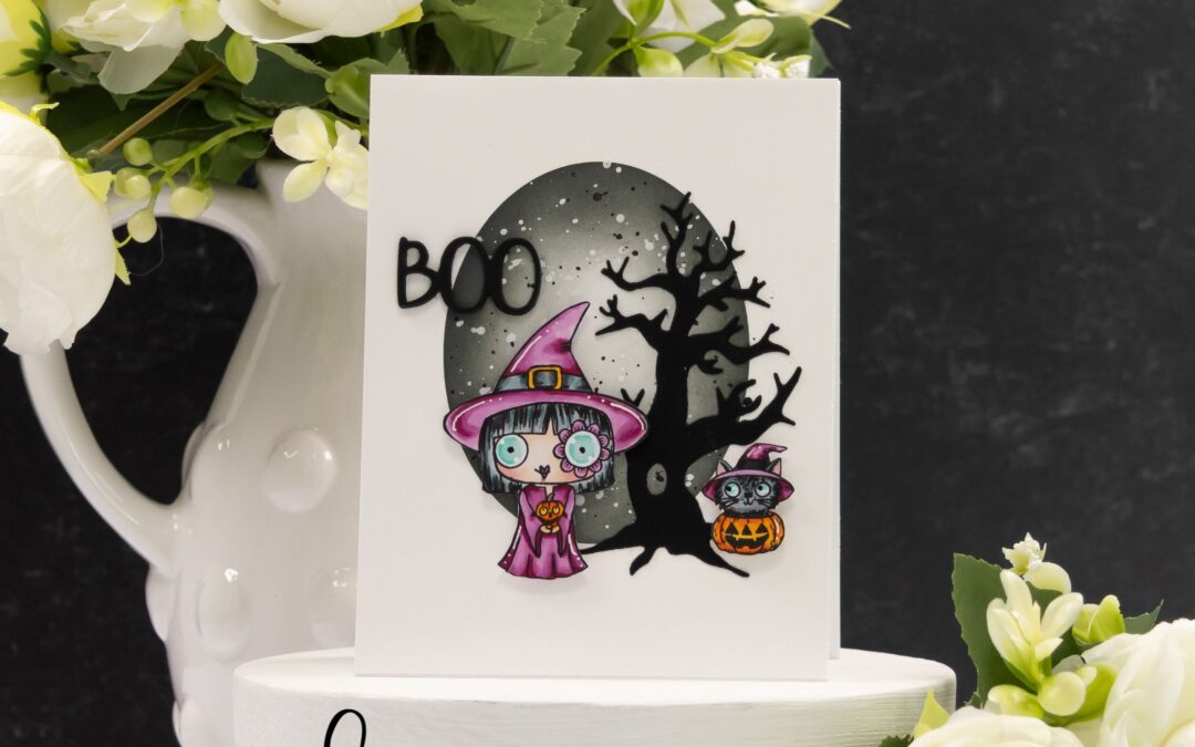
Guest Designing for AALL & Create: Whimsically Spooky
Kicking off my guest design journey with AALL & Create, I paired my clean-and-simple style with their whimsical “Moonlight Mischief” stamps. A spooky sky, a quirky witch, and her feline sidekick tell the story on this card front. Products are linked on my blog and available from www.aallandcreate.com and stockists worldwide.
STAMPtember® Collaboration: Doodlebug Design
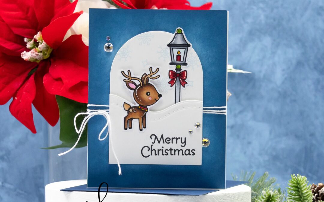
My final STAMPtember® 2025 card is here, featuring the collaboration between Simon Says Stamp and Doodlebug Design! 🦌❄️ With a sweet reindeer, snowy hills, and a festive lamp post, this design wraps up an amazing month of collaborations in the most joyful way. I can’t wait to see what next year brings!
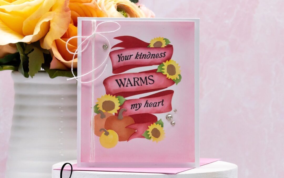
Your Kindness Warms My Heart
This version of Simon Says Stamp’s STAMPtember® Pumpkin Blessings set takes on a softer look with pink tones and the heartfelt sentiment, “Your kindness warms my heart.” Sunflowers and pumpkins add cheerful autumn charm, while twine and gems finish the design with a polished touch. A fresh take on the same set that feels brand new!
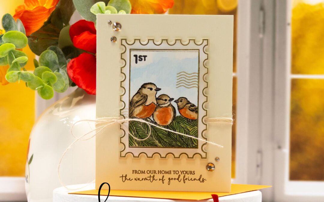
STAMPtember® Collaboration: Penny Black
Happy mail meets handmade charm! 💌🐦 Today’s card features the STAMPtember® collaboration between Simon Says Stamp and Penny Black Stamps. With its bird trio, postage stamp frame, and heartfelt sentiment, this design is full of warmth and connection.
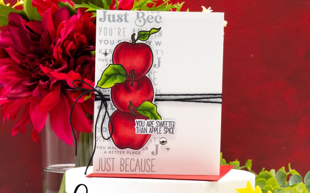
STAMPtember® Collaboration: Brutus Monroe
An apple a day is even sweeter in card form! 🍎✨ Today’s card features the STAMPtember® collaboration between Simon Says Stamp and Brutus Monroe. With its bold apple stack, subtle background stamping, and warm sentiment, this design is crisp and full of autumn charm.
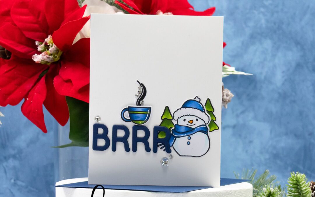
STAMPtember® Collaboration: Memory Box
Brrr… it’s chilly out there! ❄️☕ Today I’m sharing a frosty but cozy card featuring the STAMPtember® collaboration between Simon Says Stamp and Memory Box. With its cheerful snowman, bold “BRRR” sentiment, and steaming cup of cocoa, this one is full of winter charm.

Grateful
This card for Simon Says Stamp’s STAMPtember® release celebrates the beauty of fall with Copic-colored leaves in rich, vibrant hues. The “Grateful” sentiment gets extra depth with marker shading, while a soft aqua background keeps the whole design fresh and bright. A few sparkling accents finish it off, making this the perfect card to send a little gratitude this season.