Hi there!
Today’s projects are for the Altenew Educator Certification Program (AECP) Level 3 class called “One Stamp, Six Ways”. I chose this class because I love the idea of using a set (or a kit) as much as possible so that I can get maximum value out of the supplies I purchase. For this class, I used a kit (Altenew Lush Garden) instead of just a stamp set, but I think the overall concept is still the same.
Card 1: Gold Accents:
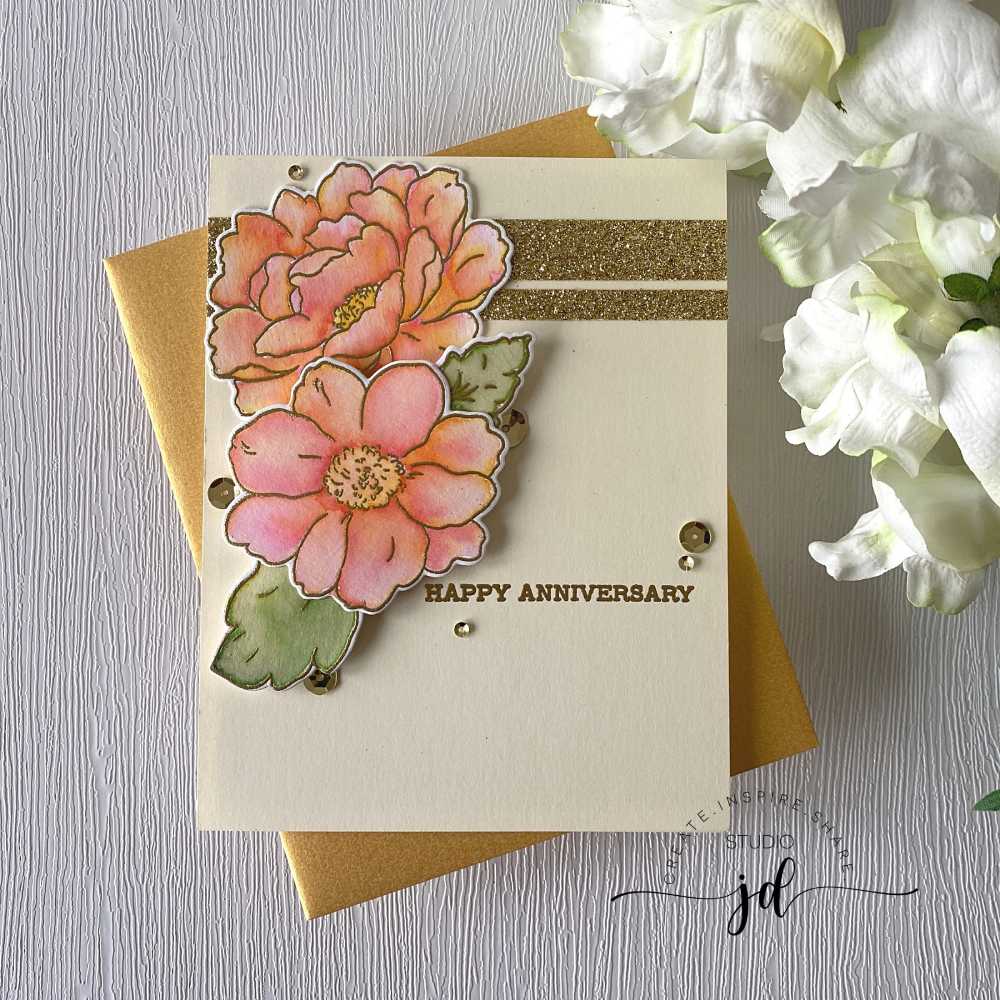
For Card 1, I heat embossed the flower outlines in gold and painted them with Altenew inks. I arranged them on my panel with a few strips of glittery gold card stock to bring out the shimmer and amp up the sophistication of the card for a simply gorgeous result.
Card 2: Double Embossing:
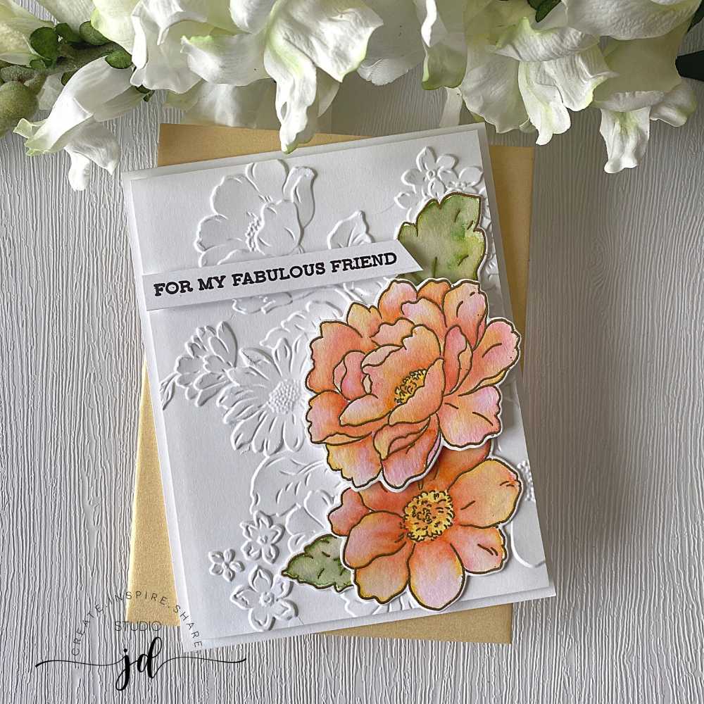
The Lush Garden kit comes with an embossing folder that pairs perfectly with the stamps in the kit, so for Card 2, I used the same technique for the stamped flowers as I did with the first card (heat embossed in gold and painted with Altenew ink), but this time I arranged the flowers over a panel that I embossed with the embossing folder from the kit. I used a bit of foam tape to add even more dimension. This card is very clean and simple, but all the dimension really makes it stunning.
Card 3: Ink Blended Embossed Panel:
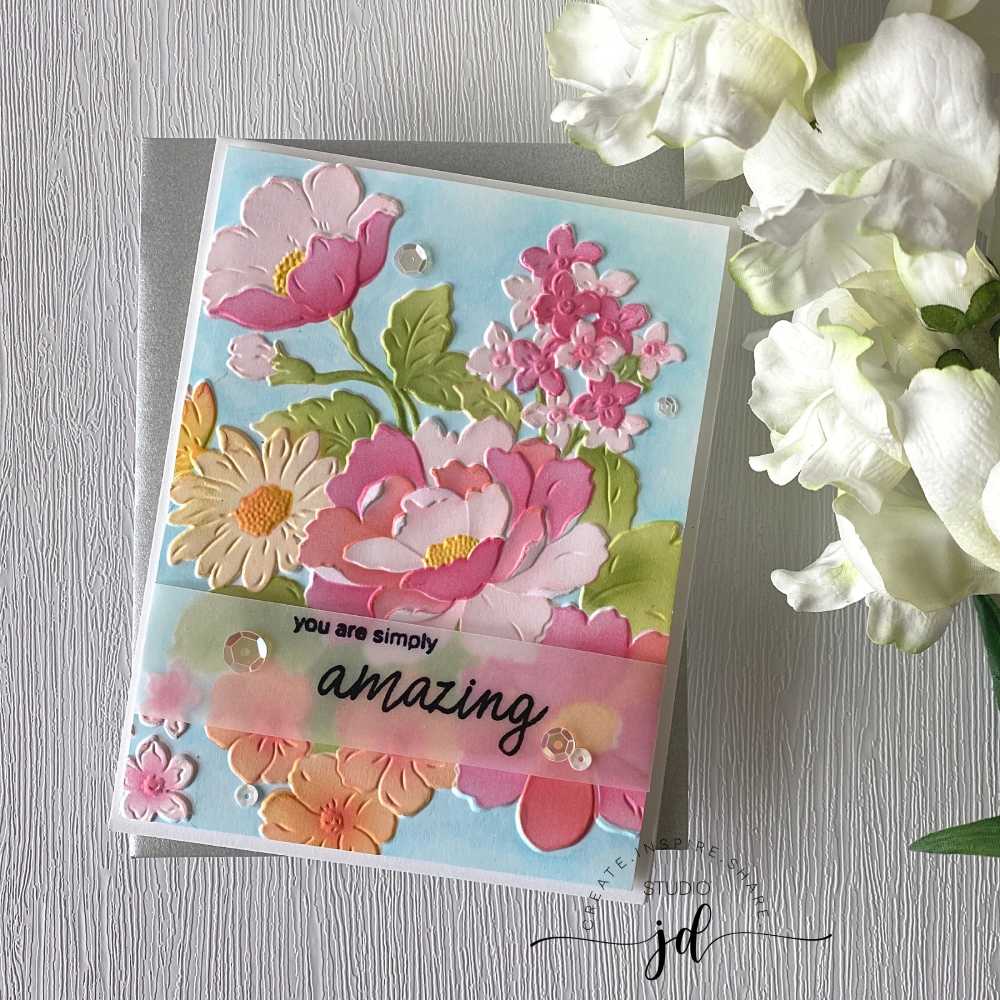
For Card 3 I used the embossing folder again, but this time I ink-blended all the flowers using the coloring stencils that come in the kit. This was my first time using a coloring stencil with an embossing image and I was so surprised how easy it was and how amazing the results were! So pretty! To make the flowers stand out, I used some light blue Copic Markers to color around them and give them a bit of a backdrop. I then heat embossed my sentiment in black on a piece of vellum and wrapped it around the embossed panel. This card has way more color than most of my cards but I just love how it turned out!
Card 4: More Ink Blending and Embossing:
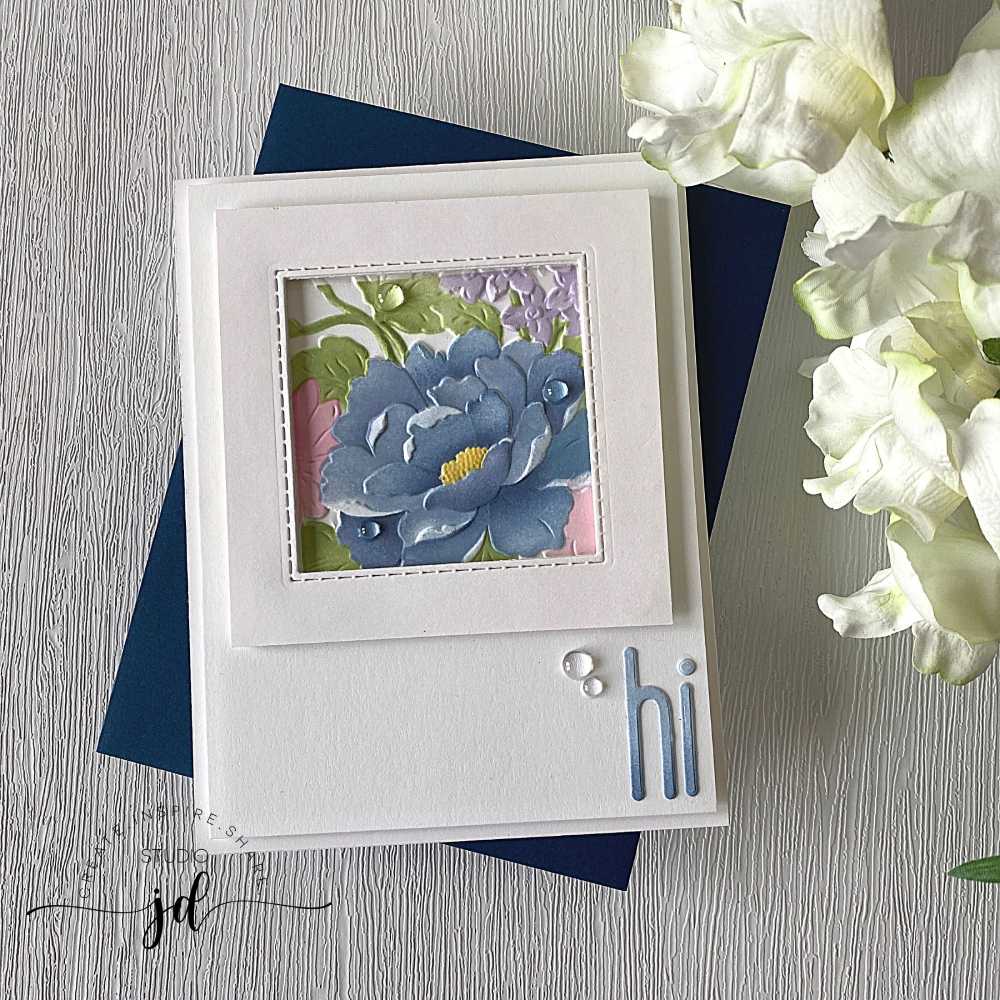
While I still had the embossing folder out, I thought I’d try to spotlight one of the larger flowers on the panel. I used the coloring stencils to color in the area I wanted to focus on, then cut it out and framed it. I added a quick “hi” to the bottom of the card using my Tall Alphabet (lowercase) dies, which I also ink-blended to match the flower. This is such a soft and sweet card!
Card 5: Much Bolder, and a Little Shabby-Chic:
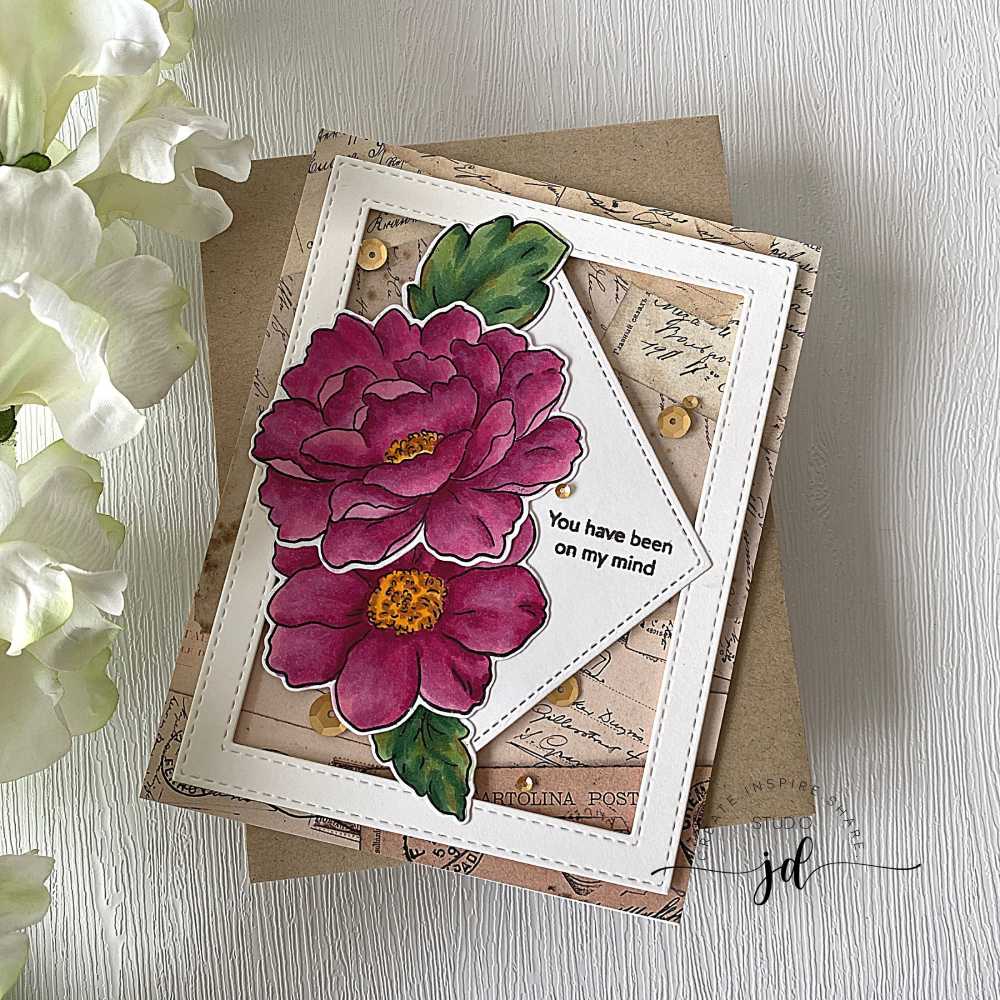
For Card 5, I decided to color in the stamped flower images using my Copic markers in a rich, regal purply-red color. I went outside my normal style with the background on this card by framing the flowers and mounting them on a piece of patterned paper. I like the vintage, shabby-chic look of the purple with the old paper – and the added sparkle with the gold sequins.
Card 6: Layering Stamps:
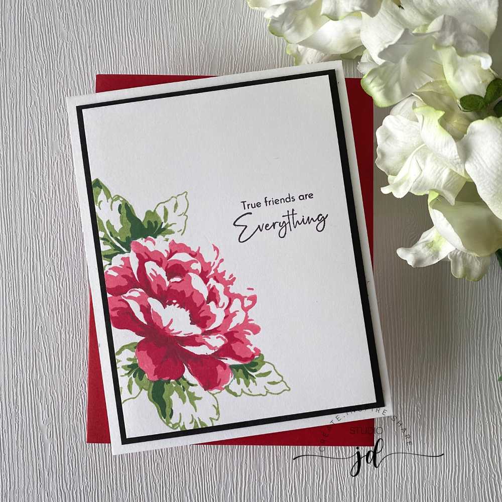
The stamps in this kit are layering stamps so for Card 6 I decided to make the most of the layers in a bold, beautiful red. I skipped the outline stamp on the flower and just used the three layers to give a more impressionistic feel to the flower. I mounted it on black to make it stand out but didn’t think it really needed any further embellishments. I just love how this card turned out – simple and elegant and just beautiful.
And there you have it. Six very different cards from one kit. Which one is your favorite?
Hope you have a wonderfully creative day!





0 Comments