As most of you know, I’ve been participating in the Altenew Educator Certification Program (AECP). A few weeks ago, I finished all the Level 1 courses for the program and was given a final challenge that I need to complete before I can move on to Level 2. So, today’s post is all about my final challenge project – and it’s a long one! You might want to grab a cup of coffee (or a martini) because I have a lot to share with you!
Here is a summary of the Challenge:
- Select any 3 components from the classes in Level 1
- Create his and her card sets (2 sets, 4-6 cards per set)
- Each card should have a similar and cohesive theme
- Create packaging for each set
- Use one recycle element on a set or on its packaging
I selected the following 3 components from the Level 1 classes:
1. Clean and Simple Boutique Cards – As you’ll see, all my cards have a “less is more” feel with just a few interesting components that elevate them without overdoing it. And, of course, the packaging I created for each of my card sets was a concept I learned in this class.
2. Irresistible Inking Techniques – I absolutely love my inks and for this project I chose to do both the direct-to-paper technique and the technique where I painted with my inks.
3. Easy Die Cutting Techniques – Each of my cards uses a stamp with a matching die, but I’ve also incorporated a die inlay into one of my cards since that was a new technique to me in Level 1 and I really wanted to try it again.
You all know how much I love adding sparkle to my cards, so I decided to also incorporate elements from:
4. Let It Shine – I’ve used some form of “shine” on each of my cards – either heat embossing or embellishments.
A Cohesive Theme with Similar Focal Pieces
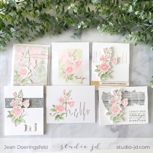
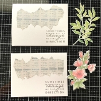
I wanted a cohesive theme across both sets of cards. To achieve this, I created masculine and feminine versions of the same card using similar layouts and color tones.
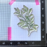
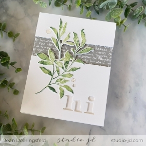
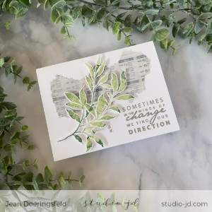
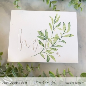
- Masculine Set: For the leaf cluster I stamped the image in Frayed Leaf ink, then “thumped” the image with both Forest Glade and Evergreen inks before stamping it to get some variation in color and add depth to the image. On a few of the cards, I used the coordinating die to cut out the leaf image.
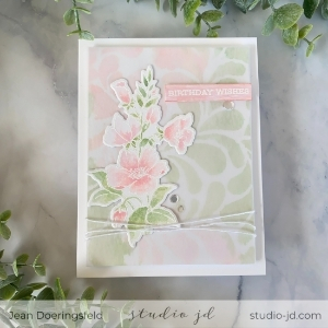
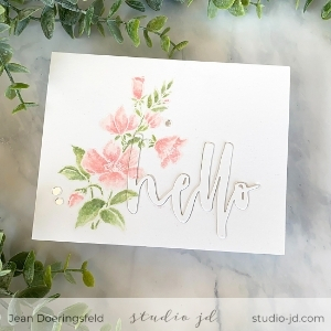
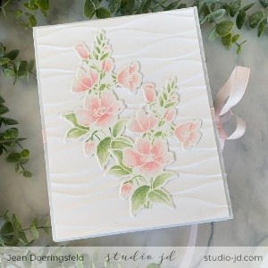
- Feminine Set: For the flowers, I stamped the image with VersaMark ink and heat embossed it in White. I then used my inks as paint to paint the image. As with the masculine focal image, I used the coordinating die to cut out the image for some of the cards.
Creating the Focal Images:
Now let’s dive in!
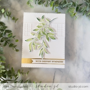
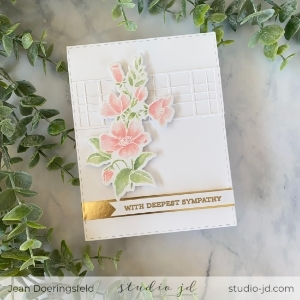
Card 1: With Deepest Sympathy
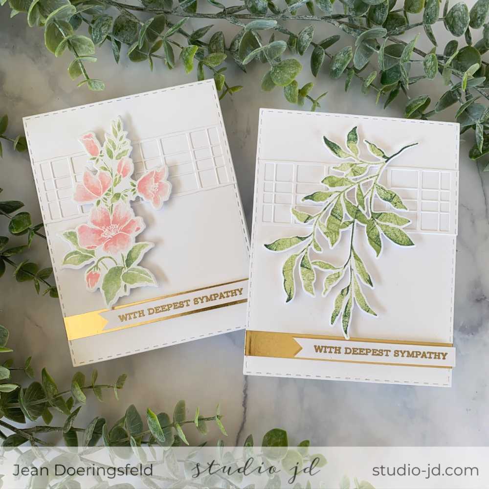
Card 1 Process & Tip Photos:
1. Die cut 3 card fronts using the stitched shape die.
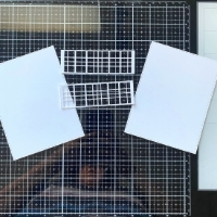
2. Use one of the stitched shape card fronts to die cut the layered plaid cover die (Yep! You’re
die cutting a die cut).
3. Cut apart the stitched plaid die so you can use it on both the feminine and masculine cards
and adhere one piece to each of the remaining stitched card fronts [see photo above].
4. Pop up the focal image over the plaid using foam adhesive – be sure to leave room at the
bottom for a sentiment.
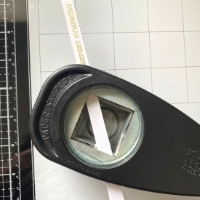
5. Heat emboss the sentiment in gold. Tip: Use a square punch to get a perfect banner end to
the sentiment strips [see photo above].
6. Adhere a strip of gold washi across the bottom the card front and pop up the sentiment
over the top with foam adhesive.
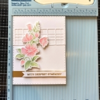
7. Use foam tape to adhere the completed card fronts to the card bases. Tip: Use the corner
of your Score Buddy or stamp positioner when placing the card front on the card base to
ensure the edges line up perfectly [see photo above].
Card 2: Thank You
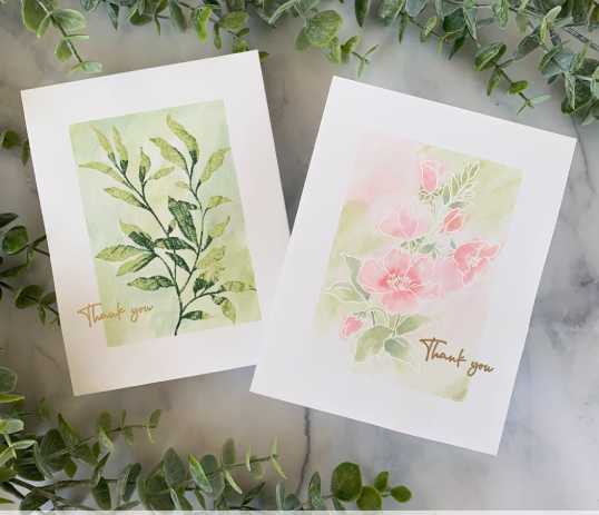
Card 2 Process & Tip Photos:
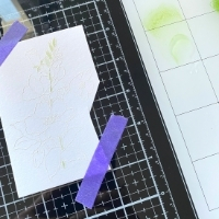
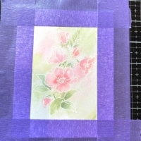
1. Mask off a rectangle on a 4.25×5.5 inch area on watercolor cardstock [see photo above].
2. Create your focal image in the center of the unmasked area [see photo above]:
a. For the Masculine card, stamp the leaves using the thumping technique, then stamp again
with VersaMark ink and heat emboss with clear embossing powder. Tip: Stamping with
VersaMark over dye ink “seals” the dye ink onto the card and protects it from smearing. It also
gives the image a gorgeous shine and makes the colors a bit more vibrant.
b. For the Feminine card, stamp the flowers with VersaMark ink, then heat emboss with white
embossing powder.
3. Use your inks to “paint” each of the images and backgrounds. Tip: Smoosh your ink pad down
on a glass craft surface to create a paint palette. Then spray the edge of each color with just a bit
of water so that you can gradually pull in color as needed.
4. Wait for the paint to dry completely before removing the mask.
5. Stamp the sentiment using VersaMark ink and gold emboss it on the card front.
6. Use foam tape to pop up the card front on the card base.
Card 3: Hi
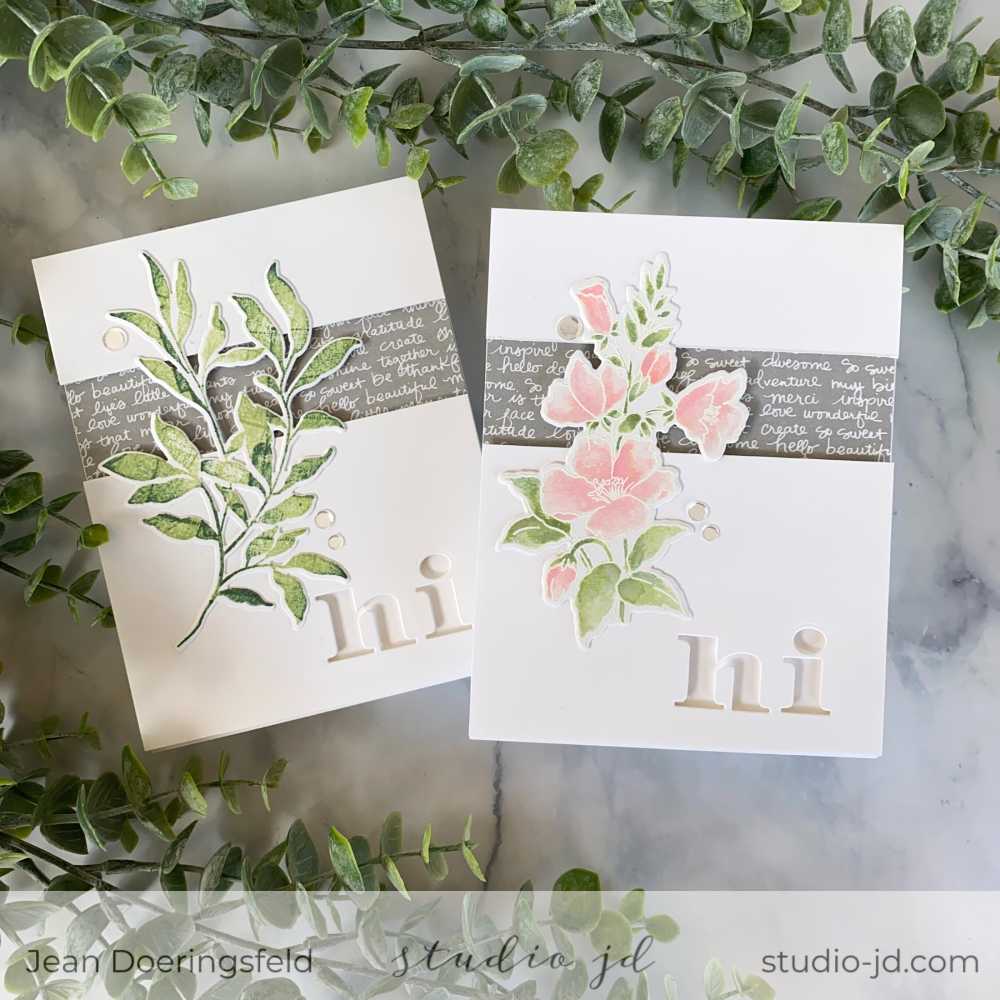
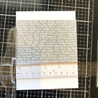
1. Adhere your “valley” patterned paper to your card base. Tip: If you are using a patterned paper with
words, like I did on these cards, you’ll want to use a T-ruler to make sure that the paper is straight [see photo
above].
2. Cut a card fronts at 4.25 by 5.5 inches, then cut a 1.5 – 2 inch section out of the card front to create
the “valley”. The section you cut out should be in the top section of your card. You can pick any size for
your valley – just make sure your pattern paper fully covers the “valley” and that your focal point can
span across it.
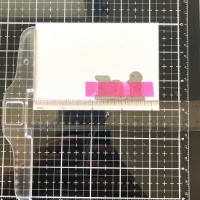
3. In the bottom right section of the card front, die cut the word “hi”. Tip: Use your T-ruler to make sure
the letters of your word is straight [see photo above].
4. Put foam tape on the back of the two sections of the card front, being sure not to put tape over the
cutout words, then align the card front pieces on the card base.
5. Adhere your focal piece on the top of the card, being sure that the focal piece spans across the
valley.
6. Add a few gems to give it a bit of shine.
Card 4: Inspirational (with a Recycled Element)
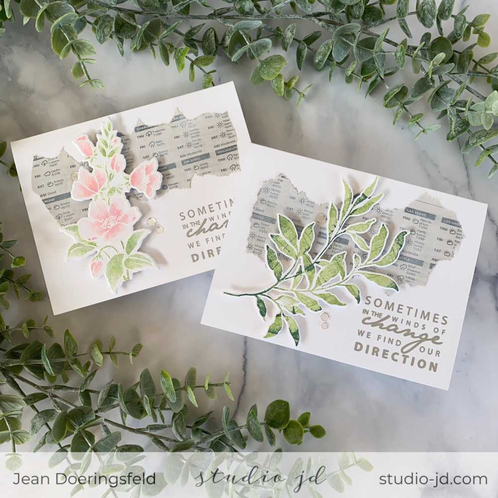
Card 4 Process & Tip Photos:
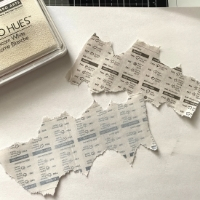
1. Tear off a section of the newspaper large enough to fit across your horizontal card base.
2. Optional: Use white pigment ink and swipe the ink pad across the newspaper clipping to soften the look
of the print. Be careful not to tear the newspaper. Also: Be aware that if you do this step some of the
newsprint will transfer to the ink pad and you’ll need to clean it off and re-ink your pad. I chose to do this
step because I wanted a softer look for these cards and found the color of the newsprint too dark for what
I wanted [see photo above].
3. Adhere the newspaper to the card base using a glue pen to ensure the glue does not show through the
newspaper.
4. Stamp the sentiment using VersaMark in the lower right corner of your card front and heat emboss it
with silver embossing powder. I chose the sentiment for this card because it referred to “wind” and I
thought it tied in nicely with the weather section of the newspaper I used as the background, but you could
pick anything and it would still look great.
5. Adhere your focal point image to your card using foam adhesive.
6. Add a few gems to the card front to give it some sparkle.
Card 5: Birthday Wishes
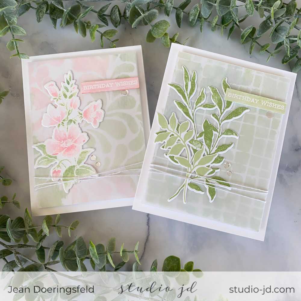
Card 5 Process & Tip Photos:
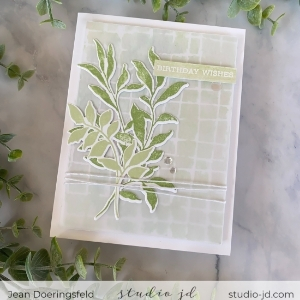
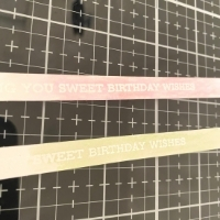
1. Heat emboss your sentiment with white embossing powder on a strip of watercolor paper.
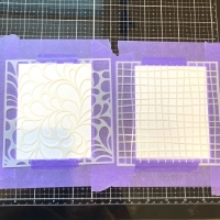
2. Spray your stencil with Pixie Spray and position it over a 4 x 5.25 inch card front made of watercolor paper.
3. Use your inks as paint to watercolor over the stencils and over the sentiment strips. You’ll want to dab up
extra water with a paper towel as you go. Let all pieces dry completely, then remove the stencil. Note: your
paint will not have “stayed in the lines” of the stencil and that is perfectly fine!
4. Cut a piece of vellum at 4 x 5.25 inches and line up it up over the top of the stenciled panel. Use a few small
drops of liquid glue to adhere the vellum to the stenciled panel – making sure to place the glue where it won’t
be seen behind the focal image.
5. Loop twine around the bottom of the panel and tape it to the back side to hold it in place.
6. Add foam tape to the back of the panel and adhere it to the card base.
7. Adhere your focal image to the front of the card.
8. Use foam tape to pop up your sentiment strip on the card front.
9. Add a few gems to the front of the card for a bit of added sparkle.
Note: For my focal point on the masculine card, I decided to stamp two of the leaves from the set – one in Frayed Leaf ink and one in Forest Glades – keeping with the same colors and style of the rest of my focal pieces but adding a bit of contrast.
Card 6: Hello
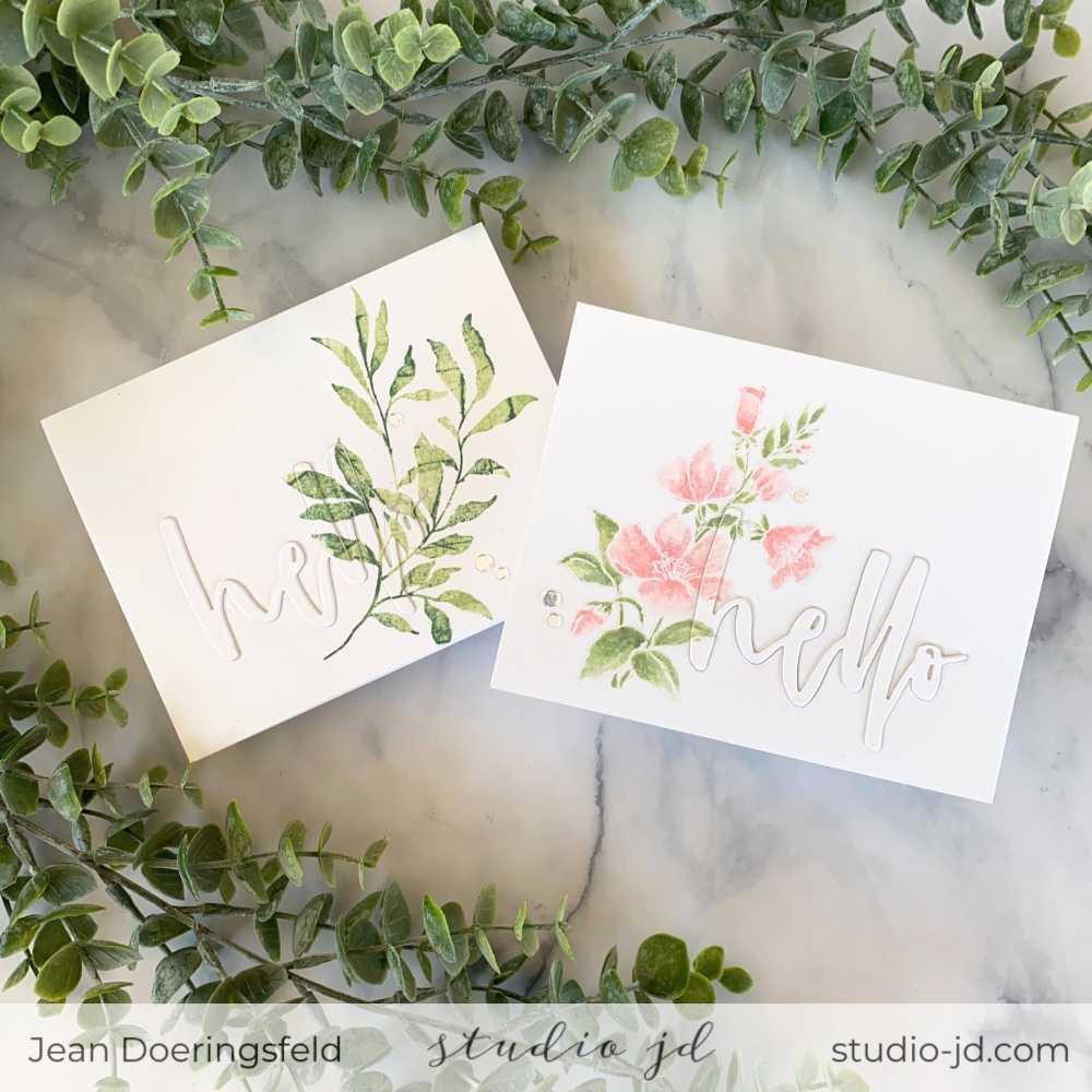
1. Create your focal image on a piece of 4.25 x 5.5 inch cardstock (remember to use watercolor paper for the
feminine card).
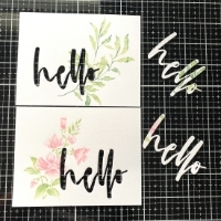
2. Cut the “Hello” die out of the card front, overlapping your focal image. Be sure to keep the cut-out “Hello” [see
photo above].
3. Cut the “Hello” die out of white cardstock 2 more times .
4. Stack the 2 white “Hello” dies together and then adhere the “Hello” you cut out of the card front to the top of
the stack.
5. Adhere your card front to the card base.
6. Fit your stacked “Hello” die cuts into the card front (it should fit in like a puzzle piece).
7. Add a few gems for some shine!
Packaging
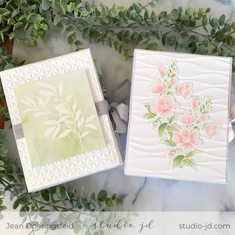
Packaging Instructions:
1. Create your template “box” using whatever measurements are needed to hold your card sets.
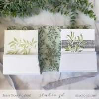
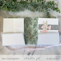
2. Optional: Reinforce your pattern paper with wide washi tape and extra card stock “panels”. I needed to do this because my patterned paper was not card stock weight and with 6 cards in each, along with envelopes, I was worried that the folds would tear and the bottom would give out.
Notice that I put the pattern on the inside of the package for a sweet little surprise when opened [see photos above].
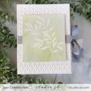
3. For the outside front of the package, use a 3D embossing folder.
4. Add your ribbon around the package, being sure to have enough ribbon to tie the package closed.
5. Add your focal image.
Supplies Used
- Altenew Positive Vibes Stamp and Die Bundle
- Altenew Leaf Clusters Stamp and Die Bundle
- Altenew Sentiment Strips Stamp Set
- Altenew Block Sentiments Stamp Set
- Altenew In Line Alpha Die Set
- Altenew Layered Plaid Cover Die B
- Altenew Waterbrush Hello Die
- Maker’s Movement Nested Essentials – Stitched Rectangle Dies
- Altenew Flowing Drops Stencil
- Altenew Wavy Grid Stencil
- Altenew Ribbon Waves 3D Embossing Folder
- Altenew Diamond Stars 3D Embossing Folder
Whew! If you’re still reading, I want to thank you so much for sticking with me. This Challenge Project was so much fun and was a great way of showing off some of the new tips and techniques I learned in the Level 1 classes. I just love how everything turned out! Which one is your favorite?
All the best,




Wow! So detailed and beautifully done. Very impressive! I foresee commercial success in your future!
What a nice thing to say! Thank you!
Every piece here is absolutely beautiful. Well done. You deserve your certification.
Thank you so much, Cheryl!
Hi Jean! Everything about these cards are simply stunning! I love all the muted colors and even if they’re CAS cards, they were beautifully executed and well thought out. Congratulations!!! I’m a fan❤️
Oh! You are so sweet! Thank you so much!
Great job! These are gorgeous!
Thank you so much, Nicki!
This one belongs in our “hall of fame” category. SO good. I knew you will knock it out of the park. I really do not have the words to describe how beautiful your sets are.
Thank you for blessing my eyes and submitting your gorgeous work to the AECP assignment gallery.
Thank you so much, Erum! I truly enjoyed creating these and I’m so glad you like them! You are so kind!
One word: MAGNIFICENT!
I love, love, love your beautiful card sets and your instructions are perfect. A fantastic, beautiful job! You have nailed it for sure! Hugs Lesley
What a lovely comment! Thank you so much!
Love these cards! You can tell you spent a lot of time on these but future variations will be done more quickly. You should take a lot of pride in these cards. Two expressions I’m not familiar with: Valley paper and Thumping technique. If you have time, could you give me a brief description? Thank you so much and good luck with the rest of your course!
Hi Nance,
Thank you so much for your kind words! I’m so glad you liked the cards.
“Valley” is a layout, not so much a paper; however, when you put the top and bottom pieces on your card for the layout, there needs to be something in the “valley”. I call that the “valley paper”. In my card, it is the grayish paper with the script/writing on it.
Thumping is when you ink your entire stamp in a light color, but before you stamp it you tap or “thump” a darker color ink pad here-and-there (not over the entire thing), and then stamp it. It’s a method for getting multiple colors in one press of the stamp to the paper.
I hope that helps!
Jean
Fantastic cards! love the layouts, colours and….everything about them!
Awe! Thank you so much!
Beautiful set of cards, can tell how much time and thought you put into them! Really love the water colored ones ☺️. Good luck on level 2!
Thank you so much, Rachel!
I love them all! If I had to pick one, it would be number 6.
Thank you Kat! #6 is one of my new favorite techniques. It is fun to do and provides so much impact!
Your sets are beautiful! You have really hit the mark.
Your descriptions, instructions and supply lists were concise, easy to understand and thorough.
Fabulous work!
Awe! Thank you so much! It’s hard to know what to include and what not to – especially with so much information to share, so it’s nice to know I hit the mark! I really appreciate your feedback!