
Hi everyone!
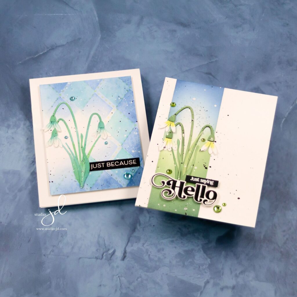
Today, I’m sharing two soft and elegant Snowbell cards featuring products from the Simon Says Stamp “Rain or Shine” release! There’s something so delicate and peaceful about these early spring blooms, and I loved creating soft, blended backgrounds to complement them. Both cards showcase ink-blended Snowbells, giving them a natural, watercolor-like look with subtle shading and depth. I also carried that soft blending into the backgrounds to create two distinct but cohesive designs.
Design Highlights
🎨 Ink-Blended Snowbells – I used ink blending to softly shade the die-cut Snowbells, adding dimension while keeping the delicate feel of these blooms.
🌿 Soft Blended Backgrounds – Each background was ink-blended to create a smooth, dreamy look, enhancing the florals without overpowering them.
🖌 Fine Splatter Details – A touch of black and white splatter adds texture and interest while keeping the designs airy and light.
✨ Elegant Sentiments & Embellishments – Simple sentiments and a few coordinating gems complete each card with a polished touch.
A Closer Look at Each Card
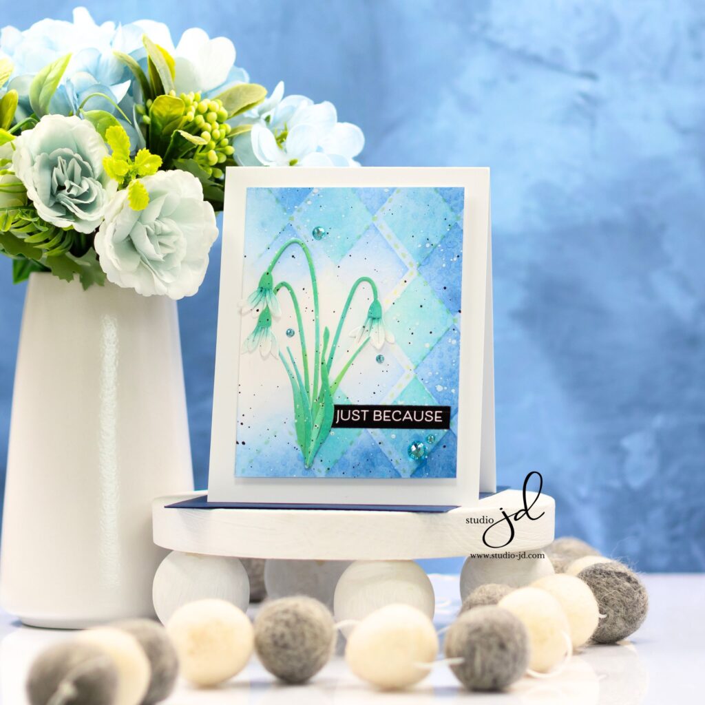
💙 “Just Because” – This card features the new Argyle Builder stencil set from the release, adding a soft geometric element behind the florals. The mix of blues creates a cool, refreshing background, making the Snowbells pop! Note that I kept a small area of the panel clear of the pattern to create a halo-like effect behind the flowers.
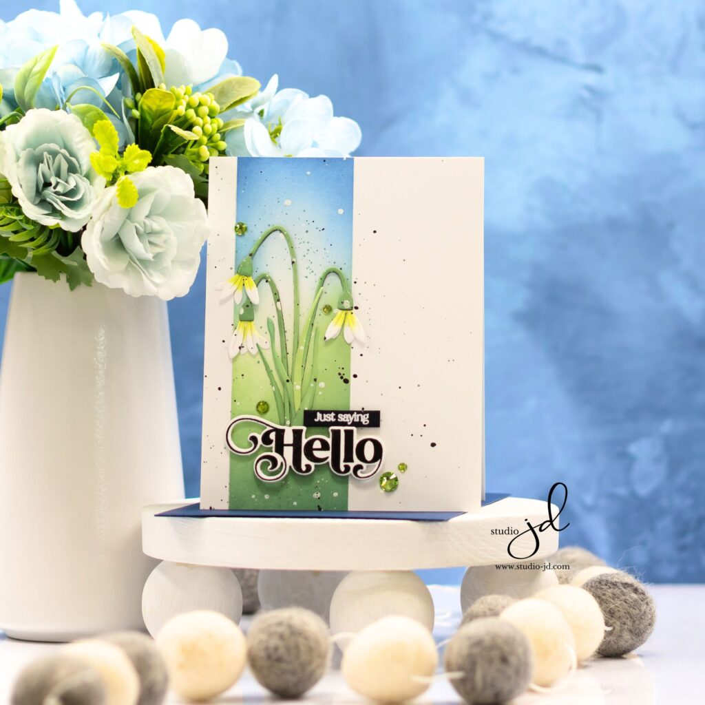
💚 “Just Saying Hello” – A clean and modern design with a soft green-to-blue ink-blended panel, grounding the florals. A few scattered gems add a final touch of sparkle!
I love how these turned out—so fresh and perfect for spring! Have you tried ink-blending your floral die cuts before? Let me know in the comments!
Have a wonderfully creative day, everyone!
")


0 Comments